top of page
UT Design Interactive Welcome Gift
Bridging Print and Spatial Design for Interactive Engagement


Introduction
Project Brief
Originally tasked with designing a standard printed poster for incoming design students at the University of Texas at Austin, I decided to push the boundaries of the assignment. I took it upon myself to create a flat-packable 3D pop-up poster that blends print media with spatial interaction. This approach aimed to engage recipients more deeply and inspire curiosity about the design program. By transforming a simple print project into an interactive experience, I hoped to make a lasting impression and encourage more students to join UT Design.
Goals
Leave an Impression
Meet the Constraints
Use University Resources
Craft a unique and memorable experience for the Design Class of 2027 admits, encouraging them to choose UT Austin.
Design a solution optimized for mass production and mailing while maintaining creative and functional integrity.
Use this project as an opportunity to explore and familiarize myself with the university’s design resources, including screen printing, laser cutting, and letterpress.
Research
Initial Prototyping
When I first considered making a pop-up poster, I realized I’d never actually built one before. To test its feasibility, I decided to create a prototype featuring the iconic UT Tower, a central symbol of the University of Texas at Austin known for its historic and cultural significance. Its blocky, geometric structure made it a perfect subject for a pop-up design due to its lack of overhangs and straightforward shape.
To learn the mechanics of pop-up construction, I watched several tutorials on crafting custom pop-up books. Armed with this knowledge, I got to work—and to my surprise, I nailed the basic structure on my first attempt. This successful prototype proved that the concept was not only possible but also practical for my intended design.

The UT Tower

What the pop-up looks like before it's cut/folded.

My first (right) and second (left) attempts at making a pop-up
Student Survey
From the start, I envisioned creating a pop-up poster for the admissions gift. However, I needed to ensure that this concept would resonate with its intended audience. To validate the idea, I conducted a survey of UT Design Class of 2026 students.
The first question focused on what they did with their original admission gift poster, revealing that many posters were discarded or stored away. I followed up by presenting a prototype pop-up poster featuring a UT Tower design and asked if such a format would increase their likelihood of keeping the gift. The overwhelmingly positive responses confirmed that a pop-up format could transform the poster from a simple keepsake into an engaging, display-worthy piece.


Concept Development
Refining the Design
Over the next few days, I focused on refining the design. Initially, the pop-up opened at a 90-degree angle, similar to a book, which limited display options since it required a flat surface and took up considerable space. To address this, I added two additional folds, allowing the poster to lie flat against a wall when open. This adjustment not only improved its display versatility but also enhanced its durability. The added folds created a protective sandwich around the delicate, intricate pop-up elements when folded up.

After crafting another paper prototype by hand, I realized that continuing in Adobe Illustrator would allow for more precise design adjustments. Digital drafting enabled quicker creation of perfectly aligned and equally measured lines without relying on a ruler or calculator. Using a laser cutter also removed the need for manual craftsmanship, allowing for more intricate and detailed designs. I added more defining feature of the tower to the design such as the grid of square windows on the front side, the surrounding buildings at the base, and of course the big clock at the top of the tower.
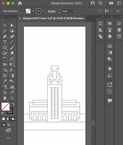
Prepping for Laser Cut
To use a laser cutter, you create a vector-format file of your design using the following color-coding:
RGB Red Stroke
RGB Blue Stroke
Vector Cut. The laser will fire all the way through the material.
Vector Engrave. The laser will fire only partially through the material.


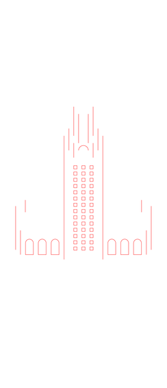
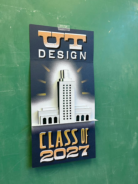
Here's how it turned out:

I set up my file accordingly with Red lines indicating cuts and Blue lines for folds. After experimenting with different laser settings, I found a power level for the Blue lines that etched deeply enough for clean, precise folds while preserving the paper's structural integrity. To ensure perfect alignment during the laser cutting process, I merged both line types into a single file for seamless execution in one pass.
Graphic Design
With the structural design complete, the final step was crafting the poster's graphic elements. Drawing inspiration from the university's 200-year-old RRK letterpress wood type collection, I developed typography that reflected its rich history. Since the pop-up feature was the focal point, I opted for a clean, understated graphic design that complemented rather than overshadowed the interactive element.

Testing out Typography with the RRK Wood type
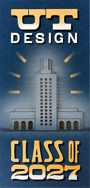
Final Mockup made with Photoshop
Execution
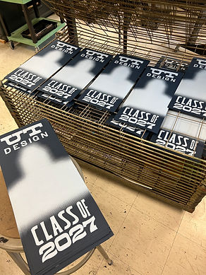
The plan was to screen print the posters first, then laser cut after. Having recently learned screen printing during my Molly Burch poster project, I approached this stage with confidence. I created three separate screens, each representing a different color layer of the design. Anticipating an incoming class size of about 80 students, we produced 100 posters to allow for potential defects and extras for archival purposes.

Color layers separated to be turned into screens
White base layer

Final print
Aligning the laser cuts with the screen-printed designs posed a significant challenge. To address this, I incorporated a margin of error into the print design and laser cut each poster individually. By consistently aligning the paper to the top-left corner of the cutting bed, I achieved precise registration between the print and the cuts. Though this manual process was time-consuming, it ensured accurate results. After cutting, I folded each poster into its flat-pack form and placed them under heavy weights overnight to set the creases. The final product came out beautifully.
This project allowed me to push the boundaries of a simple printed poster by combining analog and digital fabrication techniques. From concept to execution, each step was an opportunity to explore thoughtful interaction design while honing my technical and creative skills. The final product successfully delivered a unique and engaging experience, offering incoming students a memorable introduction to the UT design program.
bottom of page